SVGをつかった筆記アニメーションを作ろう
SVGで筆記体のアニメーションを作る案件の予告があったので、練習として作ってみたログです。
おもったより簡単だったかもしれないですが、大変なのはIllustratorでパスをうまく作らないと、アニメーションできないことが難題でした。
DEMO
http://deep-space.blue/testing/svg-animation/
まずはアニメーションさせられるSVG画像を作る
SVGで筆記体アニメーションを作るためには、筆記アニメーションをつなげたいところは一本のパスになるように、Illustratorで書き直す必要があります。
パスが得意な人に頼んだ方がいいかも。
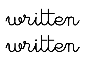
こちらは、上がアニメーション用に書き直したパスで、下がお手本の元デザインです。なかなか難しいですね…。
出来上がったらsvgに書き出します。
<?xml version="1.0" encoding="utf-8"?>
<svg version="1.1" id="レイヤー_1" xmlns="http://www.w3.org/2000/svg" xmlns:xlink="http://www.w3.org/1999/xlink" x="0px"
	 y="0px" viewBox="0 0 381.3 88.4" style="enable-background:new 0 0 381.3 88.4;" xml:space="preserve">
<style type="text/css">
	.st0{fill:none;stroke:#000000;stroke-width:5;stroke-linecap:round;stroke-linejoin:round;}
	.st1{fill:none;stroke:#000000;stroke-width:7;stroke-linecap:round;stroke-linejoin:round;}
</style>
<title>アセット 1</title>
<g id="レイヤー_2">
	<g id="レイヤー_2-2">
		<path class="st0" d="M2.5,63.8c0,0,6.6-23.9,12.5-21.3s0.7,20,3,28.5s4.9,12.8,11.8,13.1s16.1-3,18-15.1s0-25.2,0-25.2
			s-0.2,23.3,0.9,27.5S52,84.5,60.9,84.1S77.3,77.2,78.2,73s3.3-8.8,2.3-17.7s-2-10.8-5.6-10.8s-7.5,5.2-5.2,15.7
			s10.5,11.5,14.4,10.5s7.9-2,10.2-8.8s9.2-21,7.5-24.9s-3.6-5.2-5.2-3.3s-4.1,6.5-0.3,9.8s1.6,3.6,9.5,2s14.1-3.3,16.7,2
			s-6.2,21-3.3,27.5s5.6,9.9,11.5,9.2s25.2-22.3,26.6-41c0,0-2,28.5,0,34.4s8.5,11.5,17,3.3c7-6.8,10.3-13.6,11.2-15.7
			c0.2-0.4,0.3-60.2,0.3-60.2v60.2v3.3c0,0,1.3,12.8,10.5,15.1s12.5-2.6,15.4-5.9c4.1-4.3,7.1-9.5,8.8-15.1c0-0.1,0.1-57.7,0.1-57.8
			l0,57.7v5.3c0,0,1.7,15.4,14.1,17.2s20.6-21.2,20.6-21.2c0.2-1.1,1.3-1.8,2.4-1.6c0.2,0,0.4,0.1,0.6,0.3c2.3,1,25.8,14.1,33.8-6.6
			c3.3-8.5-10.5-15.1-20.6-12.1s-13.8,10.5-14.8,13.8s-2,17.4,9.2,23.6c12,6.8,27.1,3.4,35.1-7.9c8.5-12.1,9.8-28.2,16.1-29.5
			s8.2,3.3,8.5,9.5s0,32.6,0,32.6s0-32.6,1.6-35.9s10.8-11.8,21.3-3c6.2,5.2-3.3,35.3,9.5,37.4c9.2,1.5,17.7-14.8,21-21.6"/>
		<line class="st0" x1="250" y1="25.1" x2="220.5" y2="25.1"/>
		<line class="st1" x1="157.8" y1="25.8" x2="157.8" y2="26.2"/>
		<line class="st0" x1="214.6" y1="25.1" x2="185.8" y2="25.1"/>
	</g>
</g>
</svg>
pathというのが一番長い線。lineはそれぞれ、iの点とtの横棒です。
class=”st1″だけ、styleで太くなっているので、これがillustratorで太くしたiの点だな…というのがなんとなくわかるかもしれませんね。
<g>の中身は順番を変更しても問題ないので、アニメーションさせたい順に並び替えておくとわかりやすいかもしれません。
また、いらないidなどは削除してコードをスッキリしてから、css(今回はscss)を設定することにします。
<div id="demo01">
    <svg version="1.1" id="" xmlns="http://www.w3.org/2000/svg" xmlns:xlink="http://www.w3.org/1999/xlink" x="0px"
         y="0px" viewBox="0 0 381.3 88.4" style="enable-background:new 0 0 381.3 88.4;" xml:space="preserve">
        <g>
            <path class="st0 path01" d="M2.5,63.8c0,0,6.6-23.9,12.5-21.3s0.7,20,3,28.5s4.9,12.8,11.8,13.1s16.1-3,18-15.1s0-25.2,0-25.2
                  s-0.2,23.3,0.9,27.5S52,84.5,60.9,84.1S77.3,77.2,78.2,73s3.3-8.8,2.3-17.7s-2-10.8-5.6-10.8s-7.5,5.2-5.2,15.7
                  s10.5,11.5,14.4,10.5s7.9-2,10.2-8.8s9.2-21,7.5-24.9s-3.6-5.2-5.2-3.3s-4.1,6.5-0.3,9.8s1.6,3.6,9.5,2s14.1-3.3,16.7,2
                  s-6.2,21-3.3,27.5s5.6,9.9,11.5,9.2s25.2-22.3,26.6-41c0,0-2,28.5,0,34.4s8.5,11.5,17,3.3c7-6.8,10.3-13.6,11.2-15.7
                  c0.2-0.4,0.3-60.2,0.3-60.2v60.2v3.3c0,0,1.3,12.8,10.5,15.1s12.5-2.6,15.4-5.9c4.1-4.3,7.1-9.5,8.8-15.1c0-0.1,0.1-57.7,0.1-57.8
                  l0,57.7v5.3c0,0,1.7,15.4,14.1,17.2s20.6-21.2,20.6-21.2c0.2-1.1,1.3-1.8,2.4-1.6c0.2,0,0.4,0.1,0.6,0.3c2.3,1,25.8,14.1,33.8-6.6
                  c3.3-8.5-10.5-15.1-20.6-12.1s-13.8,10.5-14.8,13.8s-2,17.4,9.2,23.6c12,6.8,27.1,3.4,35.1-7.9c8.5-12.1,9.8-28.2,16.1-29.5
                  s8.2,3.3,8.5,9.5s0,32.6,0,32.6s0-32.6,1.6-35.9s10.8-11.8,21.3-3c6.2,5.2-3.3,35.3,9.5,37.4c9.2,1.5,17.7-14.8,21-21.6"/>
            <line class="st1 path02" x1="157.8" y1="25.8" x2="157.8" y2="26.2"/>
            <line class="st0 path03" x1="185.8" y1="25.1" x2="214.6" y2="25.1"/>
            <line class="st0 path04" x1="220.5" y1="25.1" x2="250" y2="25.1"/>
        </g>
    </svg>
</div>
.st0{fill:none;stroke:#000000;stroke-width:5;stroke-linecap:round;stroke-linejoin:round;}
.st1{fill:none;stroke:#000000;stroke-width:7;stroke-linecap:round;stroke-linejoin:round;}
$len01:1260;
$len02:1;
$len03:30;
#demo01{
.path01{
fill:none;
stroke-dasharray: $len01;
stroke-dashoffset:$len01;
animation: stroke1 6s 1s ease-in-out alternate forwards;
}
.path02{
fill:none;
stroke-dasharray: $len02;
stroke-dashoffset:$len02;
animation: stroke2 0.5s 7.1s ease alternate forwards;
}
.path03{
fill:none;
stroke-dasharray: $len03;
stroke-dashoffset:$len03;
animation: stroke3 0.5s 7.2s ease alternate forwards;
}
.path04{
fill:none;
stroke-dasharray: $len03;
stroke-dashoffset:$len03;
animation: stroke3 0.5s 7.7s ease-out alternate forwards;
}
}
@keyframes stroke1{
0%{stroke-dashoffset:$len01;}
100%{stroke-dashoffset:0;}
}
@keyframes stroke2{
0%{stroke-dashoffset:$len02;}
100%{stroke-dashoffset:0;}
}
@keyframes stroke3{
0%{stroke-dashoffset:$len03;}
100%{stroke-dashoffset:0;}
}それぞれのパスに、stroke-dasharrayとstroke-dashoffsetを設定して、それをanimationで動かすコードとなります。
ただ、その値はパスの長さに合わせて調節しないといけないので、scssの変数をつかって微調整を簡単にしたのがこのコードです。
これで、筆記アニメーション付き筆記体svgの出来上がり!
今回作成したデモはコチラ→ http://deep-space.blue/testing/svg-animation/
コメント